Still theSkimm, just a little more grown.
theSkimm was growing up. No longer just a newsletter company, we had expanded into new spaces, and our millennial audience had evolved with us. But while our content had matured, our brand identity hadn’t fully caught up. It needed a refresh—something that felt modern, purposeful, and distinctly theSkimm. How do we evolve without losing the essence of what made us stand out in the first place?
Same, same, but different
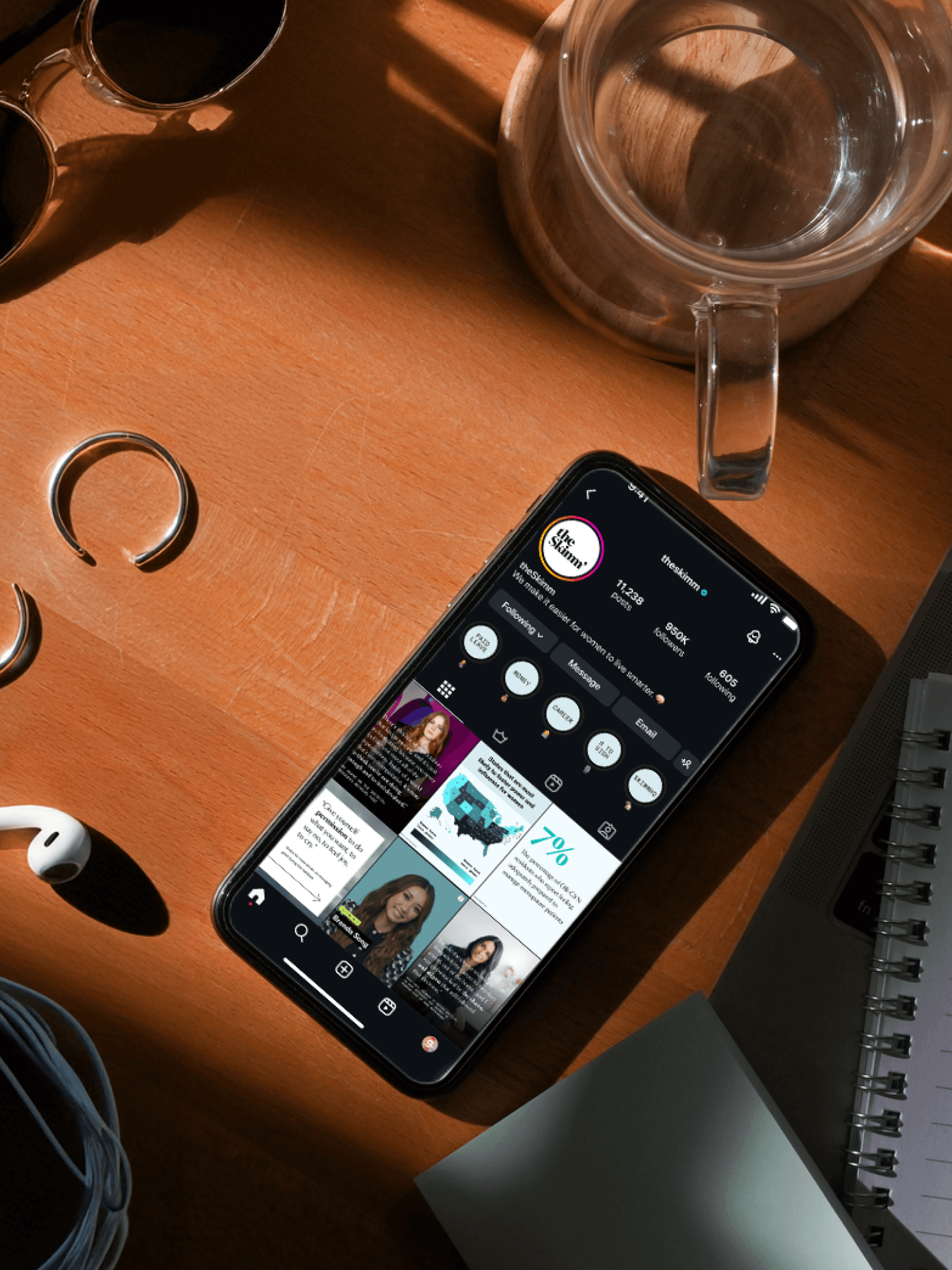
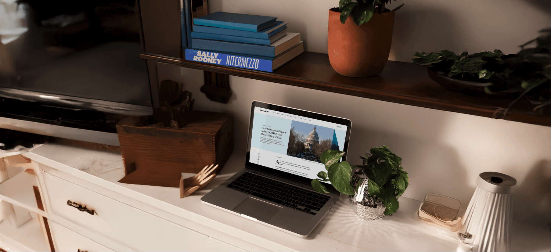
We rebuilt everything—new typefaces, a fresh color palette, reimagined image treatments, new social templates, nothing went untouched. Oh, and an editorial voice that felt sharper, more refined, and uniquely Skimm. This wasn’t just a facelift; it was a deep dive into who we are and how we show up.
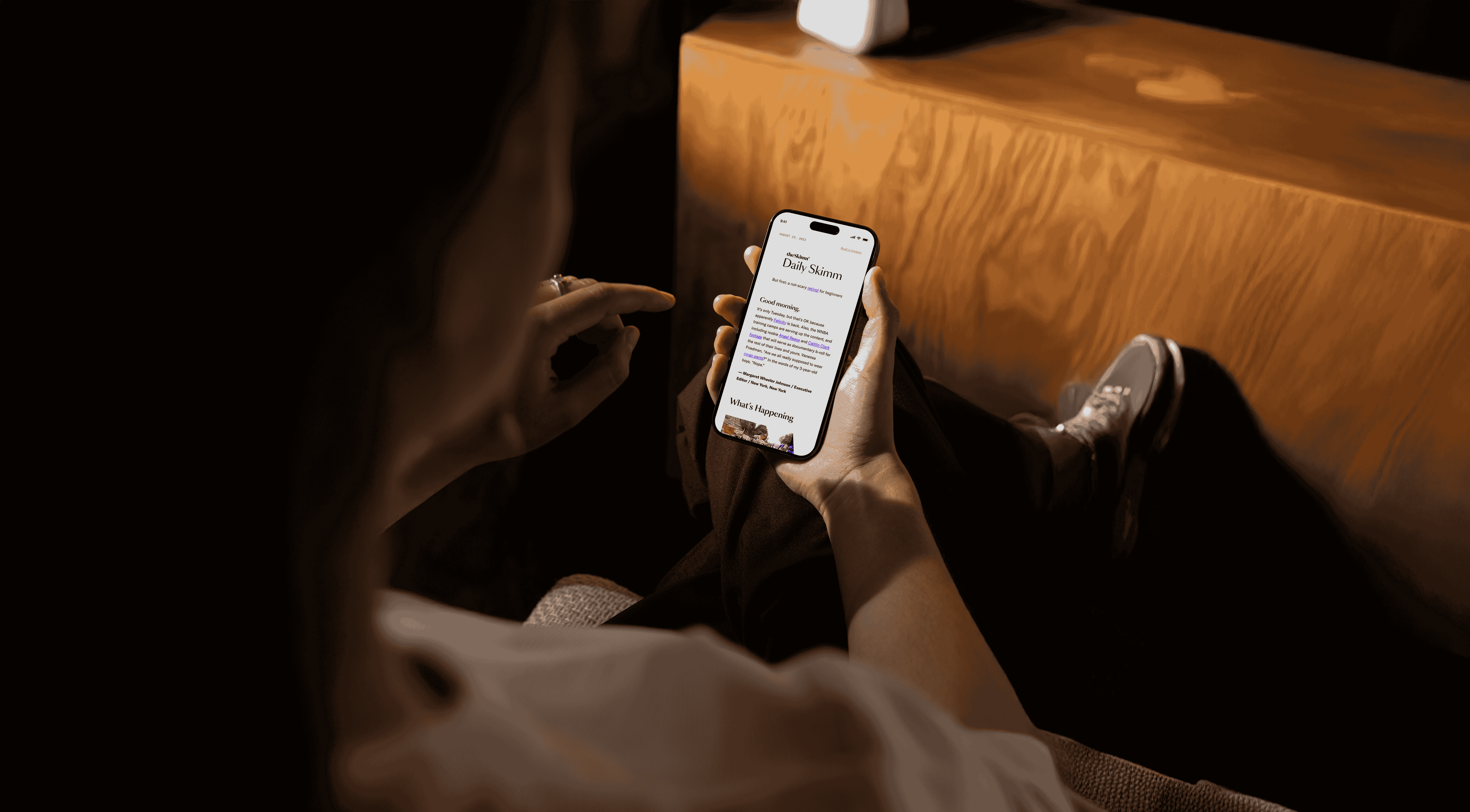
In the process, we rediscovered a key piece of our DNA: the Skimm teal line. A nod to our beginnings, this vertical line has always guided readers through our content—highlighting, simplifying, and making sense of the noise. We doubled down on it, pairing it with a bold highlight treatment to emphasize key takeaways. Every graphic element now serves a purpose—adding nuance, directing attention, and telling a story.
The result? A brand that doesn’t just look evolved—it feels evolved. It’s still theSkimm, but sharper, smarter, and ready for what’s next.
Services
Branding
Client
theSkimm
Credits
Sarah Rostant, VP of Design
Allie Hoey, Senior Creative Manager
Caroline Schaefer, Copywriter
Allison Horrell, Senior Product Designer
Shannon Corrigan, Senior Creative Manager
Drea Torres, Senior Product Designer
Year
2024